Company services
All services- 01AI-Powered AppsNewAI-powered applications with LLM integration, intelligent automation, AI agents & predictive analytics
- 02Custom SaaSCustom SaaS platforms
- 03Web App DevelopmentFull-stack web applications using Next.js, React, Laravel & Angular
- 04API & IntegrationPayment gateways, CRMs, ERPs, WhatsApp Business API & broker APIs
- 05Fintech & TradingReal-time fintech and trading platforms
- 06Website & E-CommerceWordPress websites, WooCommerce & Shopify stores with GST-compliant checkout, Zoho Books integration & India-ready payment gateways
- 07Cloud & DevOpsCloud infrastructure & DevOps services
- 08Chatbots & BotsWhatsApp Business bots, Telegram bots & AI chatbots for businesses
Industries
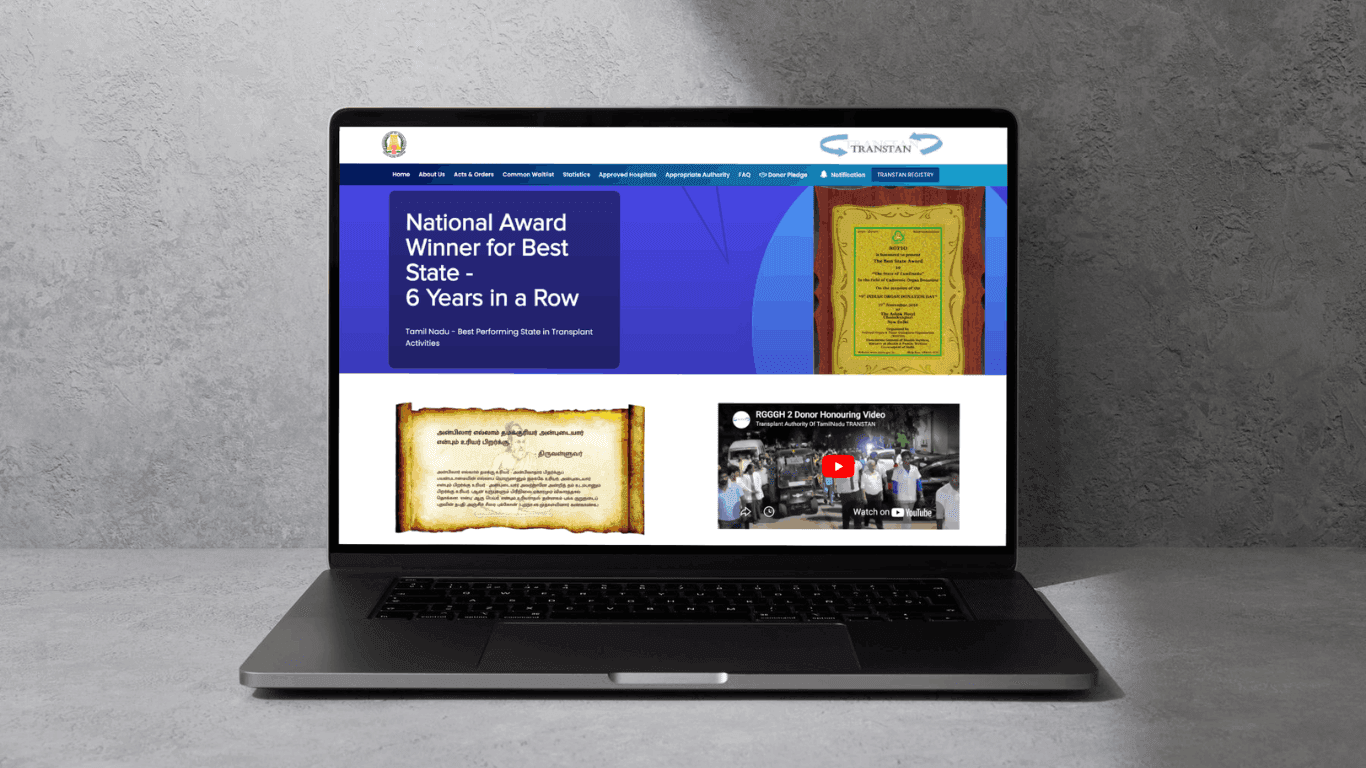
Latest case · Healthcare & Government
Organ Transplant Management System
Ready to build something?
More from Fulgid
- All productsSoftware we build and run ourselves
- Open SourceSecurity CLI, Claude Code plugin & WordPress plugins — MIT
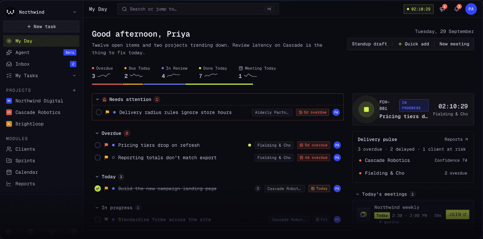
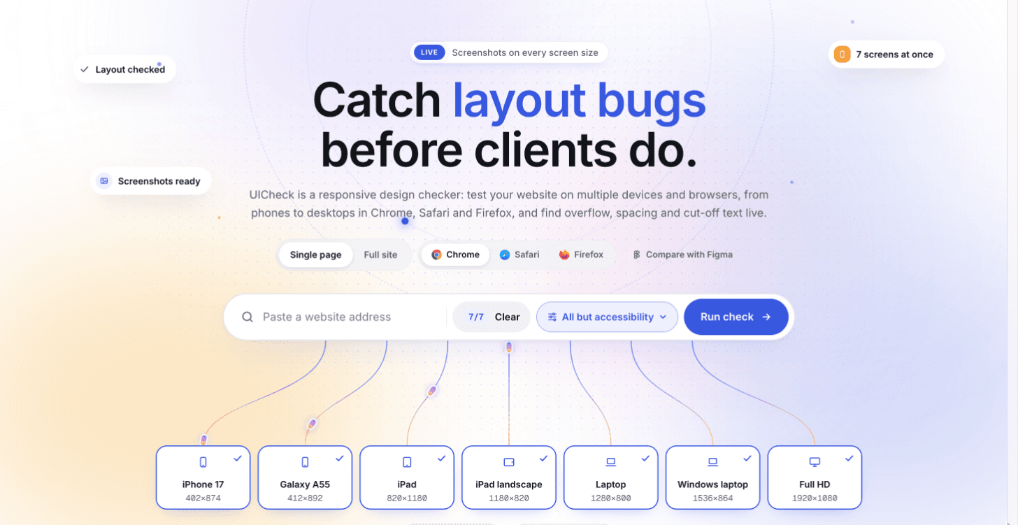
Built and used by Fulgid
We run every client project on these tools before we ship them to anyone else.